ShopDreamUp AI ArtDreamUp
Deviation Actions

2.2K Views


 Good evening listeners in the dark! This is DJ Voice with breaking news- after much elbow grease and toiling, your faithful judges have grinded through our fantastic ROUND ONE COMICS and have at long last come to our conclusions! It was a tough call on some of these and many received long debate and discussion, none of these decisions coming easily. If only half of you didn't have to die! Whether you're in or out at this point we tried to give everyone tips and advice for survival in the future. Please use this advice to your best advantage and understand that we only want to see you all improve, and have only the best intentions! Everyone on our cast we felt had potential and we are extatic to have you all create such a deverse and fascinating cast for us to slaughter- I mean follow along. Without further ado, I present the results of Round One: Survival of the Fittest!

Samantha: cosmicfail.deviantart.com/art/…
Notes:
CosmicFail's entry had very nice storytelling and good characterization of Samantha and her family, but the slow pace and disconnected feeling of the application of heysawbones and lazysmirk's characters is what set this one down a notch. The artwork was followable and a good effort but the gap between referenced poses and unreferenced was very obvious. When working from references, try not to just redraw what you see- break it down into it's basic shapes to understand why it's shaped the way it is, and the consistency of mass. Eventually it will make it easier to work away from references at times by just remembering those basic shapes, and it will be a lot less distracting. Until you get a better handle on your line work it is also recommended to work without color, or use limited shading, so you can become more confident in your figures and forms! You're off to a great start, and Samantha is a wonderfully well grounded character who brings a real-life aspect into the story and wonderful grounds for drama in one way or another.
Bob, Sef and Nikolai: whitetrashpalace.deviantart.co…
Notes:
heysawbones and lazysmirk bring to the table a short story that while not a lot of character development is made with CosmicFail's Samantha, you understand why under the circumstances and feeling of urgency. Even so, there were still some clarity issues at times. Remember the focus of the scene generally should be the action. Feel free to move the camera in to clarify what a character is doing, and what the camera is focused on, be it a character talking or an action someone is performing. Expressions and anatomy and your sketching skills are very strong, but still things feel flat somehow. In the future, we'd like to see things come at the camera more, more perspective, break out of the panels at times! Let the characters move and think about the gesture even more importantly than the anatomical technicalities! Your faces are very animated and off to a good start as are some of your posing but it feels like sometimes things could pop into the foreground a bit more.
Winner:
Bob, Sef and Niko
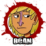
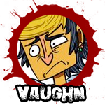
Bean and Vaughn: otaku42.deviantart.com/art/Dev…
Critique
Otaku42's duo made a funny and entertaining short story, but there was a lack of urgency to the situation. It was also fun seeing Bean become enthusiastic about something with Vaughn be clueless for once. The zombies felt inconsistent with his audition, and while it was off to a very strong start, the ending fell a bit flat. Carl's death felt random and out of place bringing the story to an awkward halt. The artwork also suffered from some clarity issues- when working without color, pay attention to your line thicknesses! thin lines seem further away than thicker lines and pushing those dynamics will help even black and white line work into more three dimension and help the reader follow along!
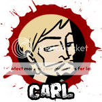
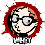
Carl and Whit: 8bitloser.deviantart.com/art/D…
Critique
8BitLoser's comic started off slowly, the beginning could have been paced out a bit quicker for better poignancy- some of the scenes and moments felt a little redundant, but the presentation of ending really made up for the slow start. It was a very unexpected twist for 8bit to kill off his own character to start with, and while his ending was very similar to Otaku42's, Carl's death made more sense and felt like an appropriate, if frustrating to Whit, ending. The simple style was effective and consistent and clear and easy to follow and the writing hit surprisingly emotionally well at the end. The addition of Otaku42's characters as comedic relief is an exciting direction, especially when we were all lead to believe that Carl was going to be your main protagonist and now we're left with Whit and wondering how she will react to this loss! It is recommended you communicate with Otaku42 in the future for help with his characters.
Winner: Carl an Whit
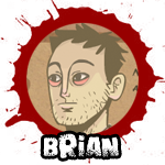
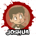
Brian and Joshua: and-also-dinosaurs.deviantart.…
Critique
gravitationaltim Crafted a wonderfully consistent and strong entry filled with characterization for both "father and son" duos. His entry felt complete and easy to follow, and the ending was very emotionally gripping. Do not be afraid of backgrounds! Simplification can work for some scenes, but especially in establishing shots, the background is another character that's just as important to the scene as the figures. Take the time to add in those details and make sure it's clear where your characters are and where they are going!
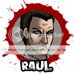
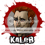
Raul and Kaleb: spesiria.deviantart.com/art/DD…
Critique
Spesiria's entry was a real step up from her audition, but the unfinished artwork and overly-spacious paneling made it feel a lot longer than it needed to be. The characterization and development of both fathers was very well orchestrated and a solid story was woven, but tightening your consistency, broadening your details in your backgrounds and varying the camera angles and how tight or pulled back the camera is from it's subject would help your work improve leaps and bounds! Some moments that could have been more poignant were deflated a bit by random emoticon-faced 'chibis' that felt out of place in the overall style of the rest of the comic.
Winner: Brian and Joshua
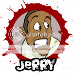
Jerry: calick.deviantart.com/art/Devi…
Critique
Jerry wonderfully portrayed both his and his opponent's characters. This was a very very tight match, and went under a lot of debate. The bright and comedic pacing of Calick's entry really hit many of the judges who are more fans of the "Shaun of the Dead" type zombie film, but ultimately it was lacking in a feeling of real danger or urgency to bring a palpable tension to the story. Molly getting bitten at the end felt sophomoric and a bit out of place. A bit of alluding to it in the beginning clearer would have helped smooth out that story movement, but your send-off for Molly was very respectful and epic! Unfortunately while Calick's comic was filled with tons of really wonderful moments, it felt disjointed at times.While it produced many chuckles, it just wasn't as emotionally gripping as koeb's.
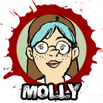
Molly: koeb.deviantart.com/art/DD-Rou…
Critique
koeb's rendition of Jerry felt a little out of character to some of the judges, (feeling like he could have been replaced by any panicked stranger,) but the reality of the situation and the hard-hitting panic Molly is feeling is tangible to the audience. This is only amplified by her flashback to her theories for how she'd handle the zombocalypse vs. being stuck in the real thing. You are trapped with her in the car feeling her panic attack. The only major set back for koeb's comic was the really abrupt and disappointing ending. It felt a bit to the reader that you might have backed yourself in a corner and took an "easy/quick" way out. We only hope you fill your plot hole in the next round, as well as include more interaction between Molly and your opponent- as well as bring us a stronger, more defined ending and a more strategic cliffhanger if that is what you're aiming for.
Winner: Molly

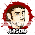
Naomi and Jason: bordeauxbrows.deviantart.com/a…
Critique
BORDEAUXbrows and miniongtt present an amusing romp with a lot of humor and fun, and it is understood that her round was created while under duress. The pacing felt slow, and suffered from some story boarding issues- too many talking heads with similar D: expressions made it difficult to connect to. In the future, balance your time for consistency, and limit the zaniness to where it will be most poignent! Spread around too much and it makes it difficult to take seriously. Again, the quality drop is understandable considering the IRL issues going on, and better time management all around for IRL obligations as well as personal challenges would really help you excel in the future.
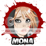
Mona: sephiramy.deviantart.com/art/D…
Critique
Sephiramy presents a fantastic comic filled with an interesting story about facing the horrific situation they're in and the desperation of people. It had a poignant message of nameless people looking for faceless people in a sea of chaos, and brings us into another stage of Mona's shock and emotional digestion of her place in things. It felt the death of Bordeaux and Minion's characters was a bit abrupt and the passage of time a bit unclear- it seems Mona runs off and then finds the people she left at the point she had arrived. A little more clarity of the passage of time would have helped relieve this better. Overall, Sephiramy's entry had many judges in tears, curious to see how Mona develops further as she digests her terror.
Winner: Mona
Hanna and Adam: tanize.deviantart.com/art/DD-r… FORFEIT
A good start- it's a shame we didn't see Tanize go further. Not enough comic is there to properly give you a good critique, unfortunately, but we wish you the best of luck in your future endeavors and are very happy to have Hanna and Adam in our cast!
Simon and Jay: buuya.deviantart.com/art/DD-Ro…
Critique
Buuya's round was fantastically well rounded with action and drama and character development. Color choice was very strategic, the gloomy grey of inside the van suddenly contrasting with Crazy Jay's commercial. While foggy bridges are an excellent setting and a good excuse to simplify backgrounds, we challenge you to try to include them a little more! Setting is always an unthought of character who's always on screen and always influencing the scene. Be sure to pay him attention as well! Buuya had wonderful characterization of both her characters and more back story for where they came from- very interesting and we are excited to learn more! Will Simon grow a back bone? The world may never know! Hannah's epic survival also leads us hoping to see what you might still have planned for her!
Winner: Simon and Jay
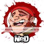
Ned: crispy-gypsy.deviantart.com/ar…
Critique
crumblygumbly puts on the table amazing plot twists and turns and a very convincing "crazy person". It is difficult to portray a character with a mental disorder, be it trauma or anything restricting to the psyche, but Crispy so far has presented Ned's case with flying colors. He is a psychological romp and you're left worried about what will hit him next in clear, honest ways that are logical within his illogical way. Gypsy's comic had a respectful treatment of her opponent, even with the mass murder going on, and Ned's obsession with "lucy" was very engaging. Perhaps it was because of the complex plot Crispy planned, but the paneling felt too tight. In the future, try to relax shots, zoom out, let the backgrounds even if simplified breath a little more around the characters. We understand you had three people to kill but next time try a shorter plot and less tight paneling and "talking heads".
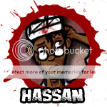
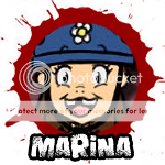
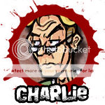
Hassan, Marina and Charlie: phantosanucca.deviantart.com/a…
Critique
Phantosanucca had a very brave idea, an interesting twist to bring his character Charlie closer to many of the other survivors, but while his idea was promising, Clarity issues became his downfall. A #1 rule in screen writing 101 is "Show, don't tell." There was a lot of telling going on, but very little showing. How can we take Charlie's word that he knew Ned for truth if there's nothing to back up the statement? The flashbacks might have been more poignant if they concentrated less on Ned and Lucy's story and more on Ned and Charlie's story, since that is the foundation of your plot. Ned died right away, leaving us with no interaction between him and Charlie and gang, and no real connection at all was established between them, making Charlie's emotion feel contrived and out of place. Again, clarifying your plot and only using devices that will benefit the story in future works will help you excel in future storytelling.
Winner: Ned
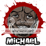
Michael: xx-blackwing-xx.deviantart.com…
Critique
Undercurrent-32's entry was a very fun adventure filled with twists and turns- the twist about Q "faking it" all this time was especially enjoyable, but a few language issues as well as other style issues brought the overall comic down a bit. The plot felt well thought out except for convenient time jumps and slightly disjointed cuts. It also felt like almost all of the characters were constantly yelling, which felt distracting overall. Micheal's motivation to double-cross Eoin and Q was also unclear, as well as there being inconsistencies in the art.
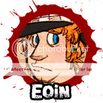
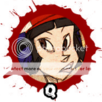
Eoin and Q: delya.deviantart.com/art/DD-Ro…
Critique
delSHARK and BeatGuy crafted a very wonderful short story that was well contained and characterized both their characters and their opponent. Even in it's short run, a lot of information is conveyed and we learn to love/hate Micheal and really want to see him get what he deserves at the end. It is visually well thought out except certain dynamics- delSHARK do not be afraid to come right at the camera! Pay attention to camera composition and what sort of angles and foreshortening and dynamics play into classic horror movies? Shots seem a bit flat and while characterization and short but clear and entertaining storytelling are strong, the visuals could still be pushed just through camera angle choices! The fight scene would have benefited from Eoin's fist coming more out of the frame, really pop it some how to help push the movement! Your line of actions sometimes need tending to as well frame-to-frame. Just keep the POP in mind!
Winner: Eoin and Q
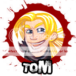
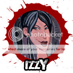
Tom and Izzy: auryn.deviantart.com/art/DD-Ke…
Critique
auryn's round starts off silly and light hearted as we left her characters in her audition, but progresses into a realiting-biting clencher at the end. A lesson was really learned by Izzy and Tom, that the apocolypse is not all fun and games and that there are humans behind the monsters. The human quality of the characters was explored excellently and we really felt the duo bond with their new friend, making Kezzy's ultimate demise poignent and tragic. "Please don't pretend it's orcs..." a seemingly funny quote that hit the heart. Too many closeups to the lips at certain points became distracting,a nd while the story was long it flowed so well we're left wanting more in a good way! The ending was touching, and Keziah's send off fitting to her character. Watch your line of action! If a person is reaching to the left side of the screen in the next shot even if it's a closeup or a further away shot they should still be moving to the left for continuity sake! Think about screen direction more as you continue your comic projects in the future.
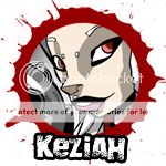
Keziah: ekuneshiel.deviantart.com/art/…
Critique
Ekuneshiel presents fantastic action sequences that are fluid and entertaining, but his round fell flat in several aspects. We know Kezzy is cool, we know she's badass, we know she's hot, we know she's prepared, but what else is she? We didn't really get to know her nor the other characters very well, it didn't seem like they connected realistically and it made her difficult to connect to. She's fantastic for action scenes but the entry felt impersonal and distant- like a video game cut scene to collect a larger party before additional battle. Tom's death felt out of the blue and random, there was very little build up to make us feel sorry for his demise if you were reading only Eku's side of the story alone. In your future comic projects try to explore who the character is beneath the surface! Explore their weaknesses just as importantly as it is to celebrate their strengths!
Winner: Izzy and Tom
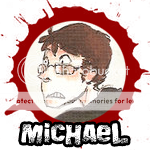
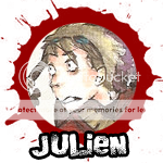

Michael and Julien: hoisanna.deviantart.com/art/DD…
Critique
HoIsAnna definitely stepped up her comic making from her audition! While entertaining, we did not necissarily feel emotionally involved in the characters. Next time delve a little deeper into their interaction and who each character is as a person! Where they came from and where they might be going!
Father Daniel: nowicantlose.deviantart.com/ar… rc-kola.deviantart.com/art/Dev…
Critique
nowicantlose and RC-Kola present a very wonderful character in Father Daniel, but their comic felt short and lacking in character development and further story. We dont' learn anything new about Daniel, and it feels more like a short anecdote about his bad luck than a full plot. Julien and Michael become generic hoodlems and while the plot twist with the helicopter was a very fun direction to take, we're still left wanting more of a little bit too much. It was also difficult to understand what was going on at times, and we're left wondering why Daniel did not join them on the helicopter as well. Too many questions left unanswered.
Winner: Michael and Julien
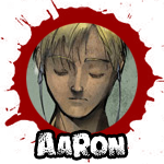
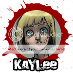
Aaron and Kaylee: penril.deviantart.com/art/DD-C…
Critique
Penril crafted an excellent story, one of the strongest entries in the competition! While he wins by default, we encourage everyone to read his entry. It is filled with character development and interaction as well as wonderfully crafted artwork and pacing and action. What might have improved the overall plot was if he had embraced the connection Loretta had between her lost brother and Aaron taking care of his sister. It was nicely touched upon at the end in a very emotional way, but more allusion to it earlier on would have made it that much more poignant.
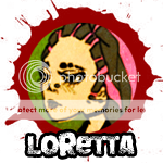
Loretta: Forfeit
Unfortunately Loretta did not submit any comic so we are unable to comment. You earn the shaking fist of vanishing doom, Loretta!
Winner: Aaron and Kaylee
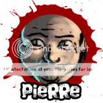
Pierre: mahlstrom.deviantart.com/art/D…
Critique
Mahlstrom presented a fantastically dark story about Pierre and his ever growing problem on his shoulder. Our suspicions from the audition are confirmed and we learn more about his affliction through his plot- his characterization of Lee was thoughtful and caring, and the twist at the end leaves us aching for poor Lee's demise. The blank faces at times were distracting though, and even with some of the unfinished pages the only real issue lay in missing details here and there that was out of place in it's over simplification. Also, in the development of the additional army characters, we wish there was a bit more personalization to their design, leading them away from "Generic army baddies" just by appearance. It is your chance to experiment with quick throw-away character designs! Have at it!
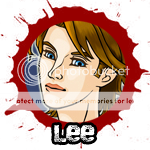
Lee: rassafraggin.deviantart.com/ar…
Critique
rassafraggin Had a wonderfully written entry as well- both of these comics were nicely crafted which made the decision difficult. We watch Lee move through his character arch from airduct hero to ass-harassed coward in a believable arch, and it was very thoughtful how Rassa revisited Renard's house in her entry, making The City feel like more of a concrete place with specific locations that expand the world and made it believable. The acidic color scheme and long complex rambling and talking heads turned off enough judges to knock Rassa's entry down a notch. It felt like many pages were text walls explaining what was undoubtedly interesting plot but was difficult for many judges to remain interested in. Sometimes exposition is important to the plot but sometimes it can feel like too much talking. A lot of action happens off screen, and the reader is left a little confused- like when Lee's fellow doctor is speaking with him and he vanishes up the airduct- we're lead to believe this is what happened, but showing his shoe or leg shimmying up into it would help clarify what is going on. This was again a very close round, both contestants putting forth very well crafted stories.
Winner: Pierre
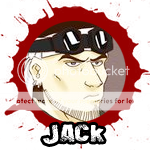
Jack: zerahoc.deviantart.com/art/Dev…
Critique
Zerahoc presented a funny, energetic story that was fun to follow along, but seemed to move too quickly. "Crutch Girl" and "Helmet Boy' were handled respectfully and their deaths seemed in character but still quick and out of the blue. Some of the panels were confusing, which made it a little difficult to follow at times, and some events seemed unclear and disjointed. Ultimately Zera crafted an excellent comic! In the future pay attention to character consistency, and also do not add cross hatching that is unnecessary.
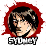
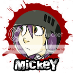
Sydney and Mickey: manic-pixie.deviantart.com/art…
Critique
manic-pixie and flipsidered produced an excellent, well rounded and startling comic filled with character development and a very unexpected twist! While Mickey might be oblivious to the world in his simpleton-way, Sydney really blossomed and grew as an individual beyond her cranky frown. Zerahoc's Jack was represented well and in character, a badass grease-monkey who while he could hack down countless undead finds himself to the beck and call of human fault.
Winner: Sydney and Mickey
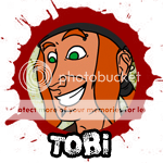
Tobi: motopsycho72.deviantart.com/ar…
Critique
MotoPsycho72 Really stepped up his game from his audition, which was noted and very much appreciated! His story was moving and funny, with bold layouts. There was a distracting difference between things he used references for and things he worked from his head- don't just redraw what you see! try to adapt your reference to fit your style! Consistency helps everything flow better. The story was a little bit slow, it feels like the "Zombie-rider" joke was milked for too many pages that could have been dedicated towards more plot development. Also, posing was stiff- let a character's gesture show through! Practice makes perfect. The punchline at the very end was also a funny note after a touching scene. Ultimately the plot felt a bit short and uneventful. There is meeting, talking, and zombie attack, but not much of the unexpected took place. In your future comic endeavors, try to toss a bit more twists and turns in for the reader!
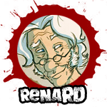
Renard: selenedragon.deviantart.com/ar…
Critique
Synicalsel's comic on teh other hand felt a bit of a step down from her audition. Time management to make sure your comic is consistant, if not as polished as you would like, would help greatly. It felt like there was a lot of medium-shots over and over again, giving that "talking head" feeling that can be avoided by varying your camera angles and how tight or far away the shot is. Ultimately, Selene was the better storyteller, bringing forth an interesting twist of Tobi meeting his demise in an instant (A case where a sudden event works well) by faceless survivors trying to escape being a sobering moment. We hoping even still, zombie-coasting catches on as the next big fad!
Winner: Renard
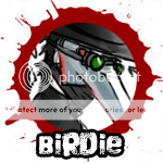

Birdie: serain.deviantart.com/art/Devi…
Critique
Serain delivers a fantastically spooky horror theme filled with intensity. It fit the horror setting very well, but unfortunately it feels incomplete plot-wise. The storytelling was a bit stiff, and Birdie's "lies" are a little too unbelievable to the audience. The art was nice even in it's sketchy state, but at times it was difficult to tell what was going on. More emphasis on backgrounds would help clarify your settings and make it easier to follow. Also, not much characterization is given to either Birdie or his opponents. You wanted this to be an "intro to birdie"- the introduction should have been the audition, we're looking for more characterization now. If you wish to keep birdie in the shadows then stress more characterization in your opponent. A serial killer is a situation where your opponent's reaction is very important, and the entire basis of the plot. It feels like we only got a fraction of the story instead of a full short story. Next time up the characterization or it could come to bite you!
Beatrice and Oz: doodle-bugz.deviantart.com/art…
doodle-bugz had a more complete plot that felt a lot more self contained and clear, but also felt a bit too simple and expected. While it was the stronger plot, the expected twists at the end and constant tempo along the way made it seem a little stiff or flat. The art was unfinished but it was clear what was going on for the most part- it is recommended that in your future comic projects you work more on your line-work and getting your forms and figures stronger before breaking it down into vector art- a strong underlying sketch is the key! While Doodle had the stronger story and characterization, Serain upheld the horror setting and mood a lot stronger.
Votes:
Winner: Birdie
Natasha: Forfeit.
Critique
Our third and last forfeit, nothing was uploaded and so we have nothing to critique. Remember that joining OCTs is a huge commitment, and to make sure you can budget your time accordingly if you are going to participate!
Jestin smilexstranger.deviantart.com/…
Critique
Although SmilexStranger wins by default she still created an adorable and hallowing 'episode' in which Jestin and the audience definitely learns a lesson about herself, a tragic send off for poor Nat, just after the two girls bonded. She even got Natasha hurling her guts out, one of her highlighted character traights! In the future, though, watch out for repeditive medium shots- again, vary your camera angle and zoom, breaking up the closeups and medium shots with more, clearer establishing and mood creating shots! You're off to a good start, just challenge yourself to do great!
Winner: Jestin
This wraps up the first chapter of DeviantDead! Contestants that remain, take a well earned rest, round two will begin come 2010. As for everyone else I hope you stick around for our future mini contests and art jams in the future as well as following along with the continuing saga of our survivors that remain! And make sure you doodle something up for the ZOMBIE WALK by the 26th!

FINAL ROUND: Good Night and Good Luck
~DJVoiceplz (https://www.deviantart.com/djvoiceplz):iconsaysplz::iconwhitenoiseplz:
---
RAPTURE DAY UPDATE!: Hey everyone! Buuya (https://www.deviantart.com/buuya) has pulled some of her "I always get my comics in on time cred" and after much grovelling, the final round will be due June 20th, 2011 at 10pm EST. You're welcome. Get crackalackin!
On that note, we also want to wish our sincerest goodbyes and congrats to gravitationaltim (https://www.deviantart.com/gravitationaltim), who has decided to drop out. Everyone join us in wishing him the best, especially on his new magical-girl-inspired comic Astron! We're expecting great things, sir.
Happy Rapture Day everyone!:zombie:
----
...
...
...
What kind of zombie contest would this be if
Semi-Finals: FIRE IN THE SKY -JUDGING-
:new: UPDATE 12/18/10: TIME IS UP, FOLKS! The dust has finally settled, and blue skies have peaked through the rolling clouds of smoke and Round Four is officially at a close! Being the semi finals, we kept a casual pace and were in contact with the semi finalists while they battled the horrors of real life as well as the undead menace in Major City! Now that we have a majority finish, it is time to begin judging. Although flipsidered (https://www.deviantart.com/flipsidered) was unable to complete her entry, she has had a much bigger project in the making! We'd like to congratulate her on her new baby, and a hearty HURRAH! from the entire DeviantDead team! So hang onto your pan
Round Three: Mutation Situation - RESULTS -
~DJVoiceplz (https://www.deviantart.com/djvoiceplz):iconsaysplz: Attention listeners in the dark! Just when we thought these monsters couldn't get more monstrous, there's been several accounts of these creatures *mutating*- look out, survivors! These zombie mutants are even more dangerous than their brain-dead counterparts! They're getting stronger, faster, bigger, nastier, smarter... Some are even pulling together new bodies out of parts of old ones- whether those parts had once been human or not. It makes us wonder how unstable this virus- if it is a virus- is. So be sure to completely destroy the brain, it's the only way to really stop them! Keep heading North, and remembe
Round Three and Spectator Event: JUDGING!
:new: Round three is now CLOSED! Please stand by while judging commences. In the meantime, be sure to read all of the fantastic twists and turns our competitors brought forth this round here: http://deviantdead.deviantart.com/favourites/?39173110#Round-Three-Comics :zombie:
~DJVoiceplz (https://www.deviantart.com/djvoiceplz):iconsaysplz: Attention listeners in the dark! Just when we thought these monsters couldn't get more monstrous, there's been several accounts of these creatures *mutating*- look out, survivors! These zombie mutants are even more dangerous than their brain-dead counterparts! They're getting stronger, faster, bigger, nastier, smarter... Some are even pulling
© 2009 - 2024 DeviantDead
Comments30
Join the community to add your comment. Already a deviant? Log In
will deviantdead be an annual competition? I'd like to join next year....